Data Science
Getting Started with Data Analysis in R
July 19, 2026 · Super Admin · 102 views
R has a reputation for being harder than point-and-click software, and for the first two hours that is true. After that the balance shifts. Because every step is written down as code, an R analysis can be re-run, corrected and handed to a supervisor without anyone having to remember which menus were clicked. For a thesis or a journal paper, that reproducibility is worth the small learning curve.
Set up the environment once, properly. Install R from CRAN and then RStudio, which is the interface you will actually work in. Create a new Project for every study so that your data, scripts and outputs stay in one folder with a stable working directory. Then install the tidyverse collection with a single command, since it gives you dplyr for data manipulation, ggplot2 for graphics and readr for importing files. Two more packages worth adding on day one are janitor for cleaning column names and gtsummary for publication-ready tables.
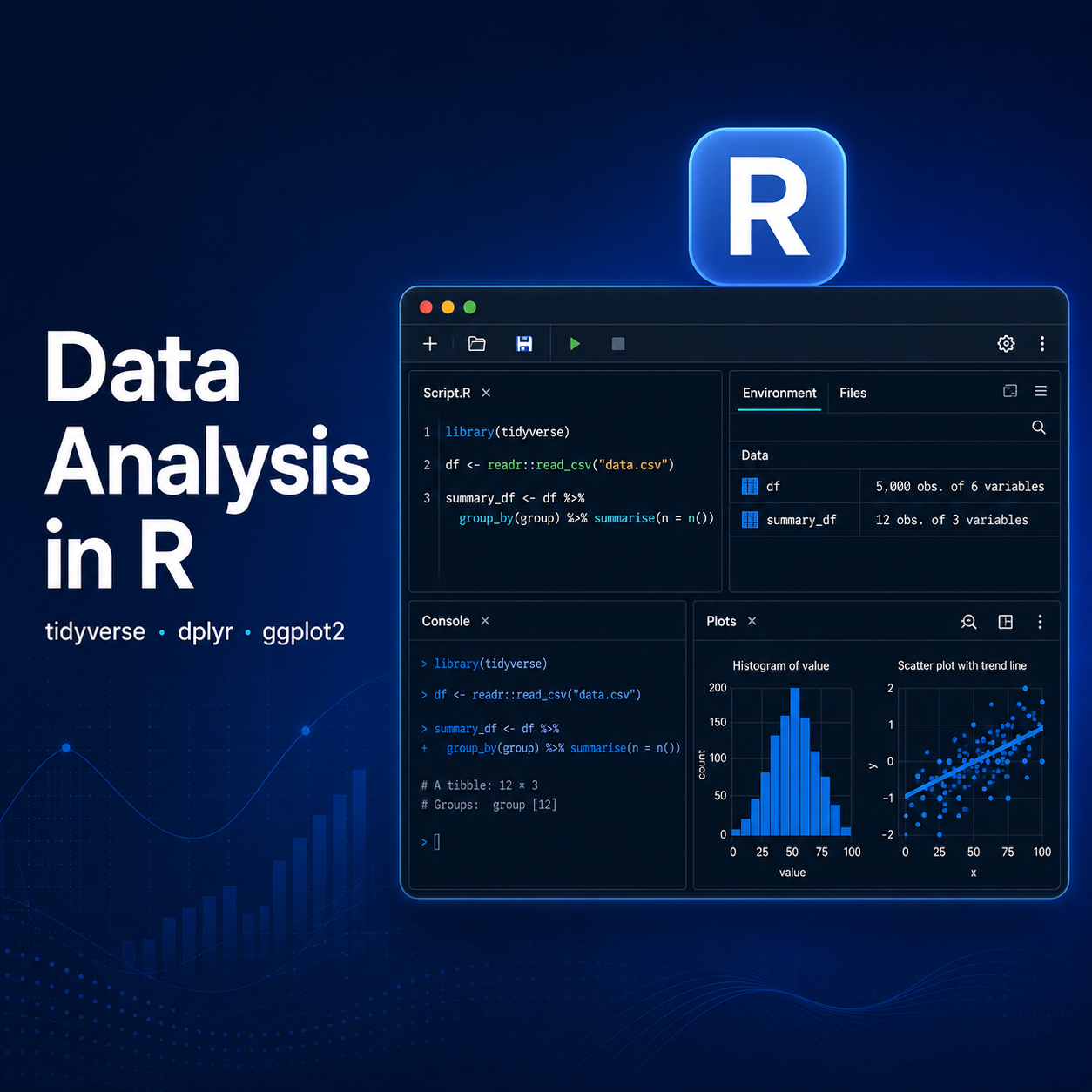
Learn six verbs and you can handle most datasets. Import your file with read_csv or read_excel, then look at it with glimpse. From there, filter keeps the rows you want, select keeps the columns, mutate creates new variables, group_by plus summarise produces means and counts by category, and arrange sorts the result. Chained together with the pipe operator, these read almost like English: take the data, filter to female respondents, group by district, summarise the mean income. Nearly every descriptive table in a thesis is built from that pattern.
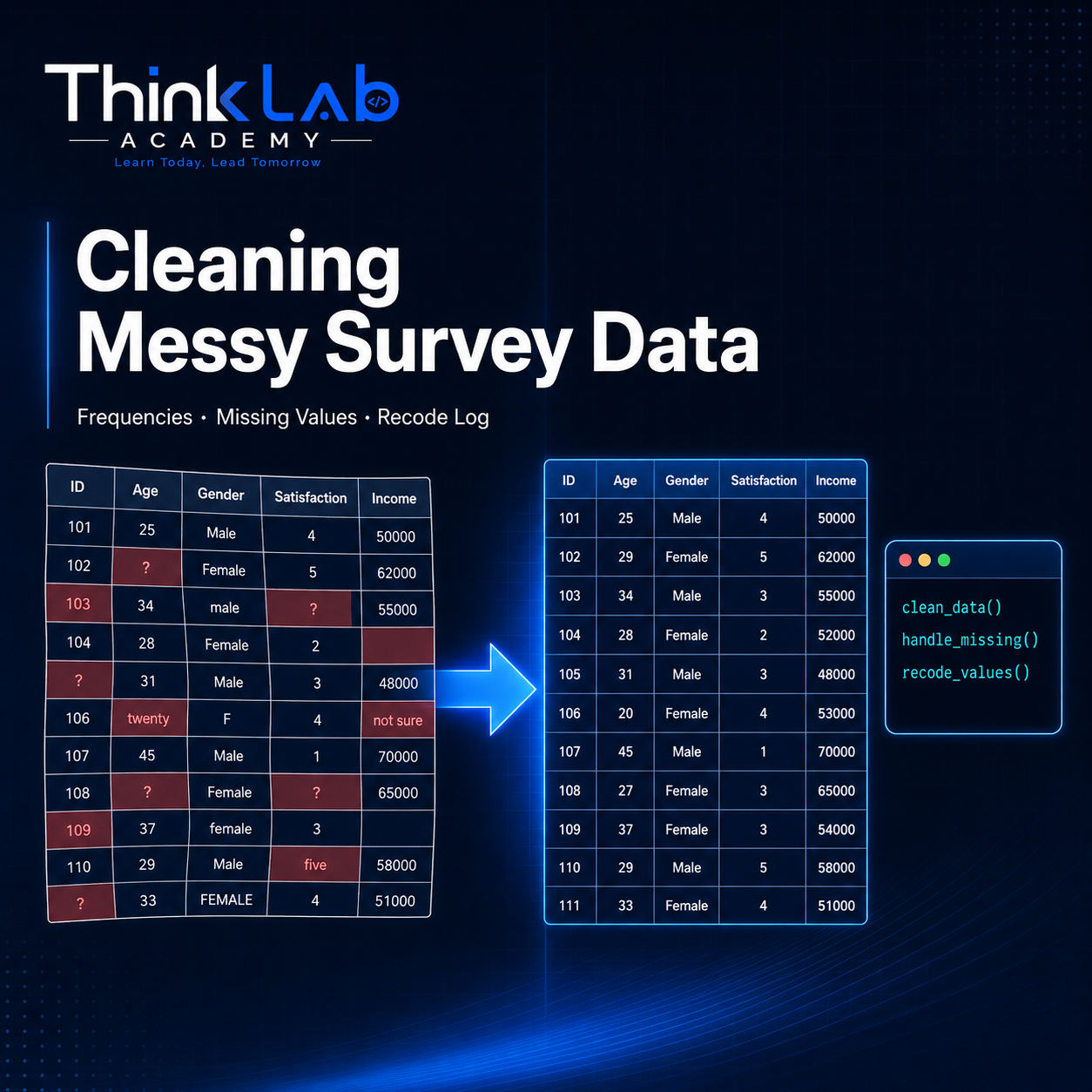
Clean deliberately, and never overwrite the original file. Import the raw export, then do all recoding in the script: convert Likert items to factors with ordered levels, recode 9 or 99 into NA, and create composite scores with rowMeans. Check your work with table for categorical variables and summary for continuous ones. Because the script holds every transformation, the cleaning is documented automatically, which is exactly what reviewers ask for.
Visualise before you model. ggplot2 builds a plot in layers: the data, the aesthetic mapping, and a geometry. A histogram of your outcome, a boxplot by group and a scatter plot with a smooth line will tell you more about your data in five minutes than a page of summary statistics. Save figures with ggsave at 300 dpi so they are ready for submission rather than screenshots pasted into Word.
Then run the model and report it cleanly. A t-test is t.test, a one-way ANOVA is aov, a chi-square is chisq.test, a correlation is cor.test, and a linear model is lm followed by summary. Pass the model to broom's tidy function or to gtsummary and you get a tidy coefficient table with estimates, confidence intervals and p-values, ready to drop into your results chapter. Once you have run this sequence on one dataset, the second project takes a fraction of the time, and everything you wrote remains reusable.
Comments (2)
R
Rahim Uddin · 1 month ago
Great article, very helpful!
K
Karim Ali · 1 month ago
Thanks for sharing this.